Background
Friends of Fish’s mission focuses on educating youth on sustainable fishing and marine conservation, especially for underprivileged students. They aim to foster respect for the ocean, encourage environmentally friendly fishing practices, and inspire young people to advocate for marine sustainability.
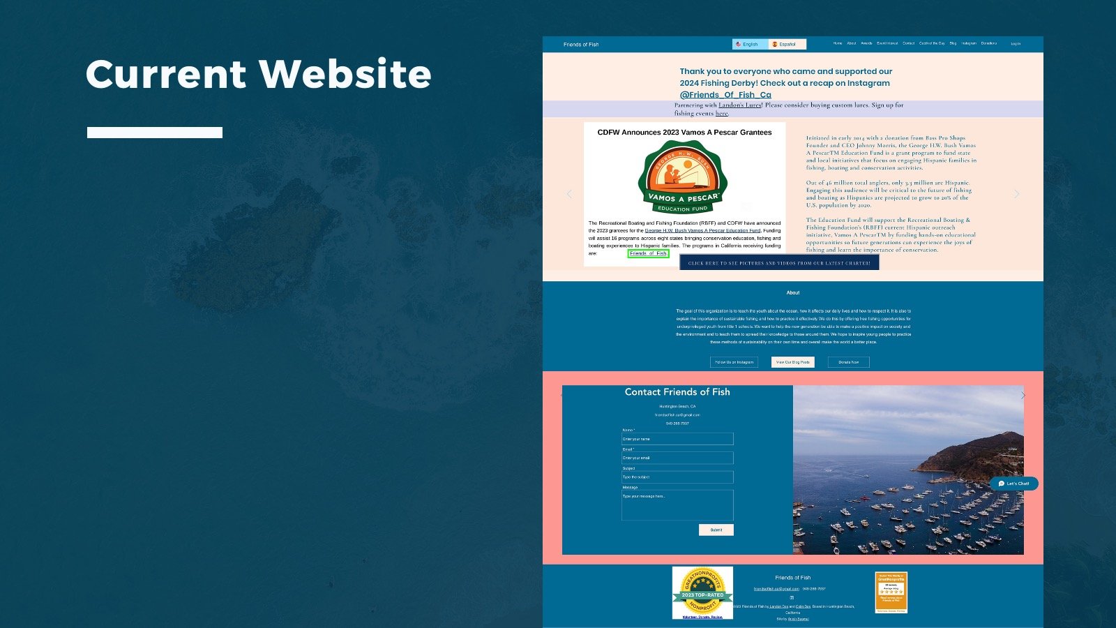
CURRENT WEBSITE
User Problem Statement
A teacher aims to educate her underprivileged students about marine conservation, providing them with accessible, engaging resources to inspire learning and advocacy for ocean protection. However, limited school funding presents challenges, and available nonprofit resources often lack youth engagement or exceed the school’s budget constraints.
How Might We?
How might we create an accessible, engaging marine conservation resource for underprivileged youth to foster a deeper understanding of ocean protection and sustainable fishing practices?
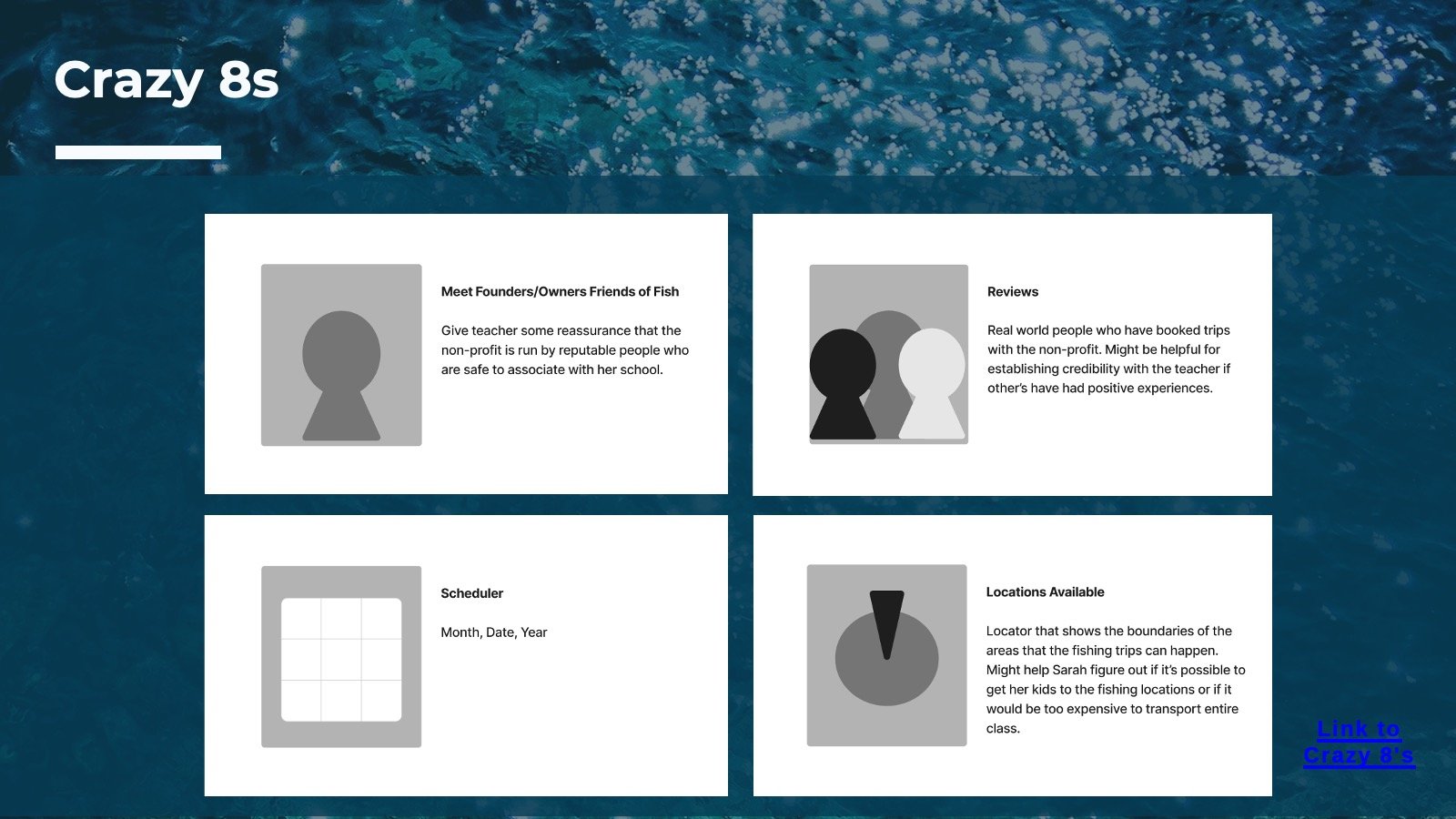
Our mind map looks into how we can support Sarah's goal of engaging her students in marine conservationThis mind map explores how the nonprofit can support Sarah’s goals by offering user-friendly navigation, funding options, educational content, and proof of impact. It breaks down elements such as reviews and customer feedback, funding options, and showing proof to ensure trust and engagement.
Document Content Hierarchy
Changes
•Reduce & focus color usage by limiting the color palette to a few key accent colors used sparingly
•Emphasize scale for key elements: Make essential headings and CTAs larger and bolder than secondary text.
•Enhance grouping with consistent spacing utilizing more whitespace between sections
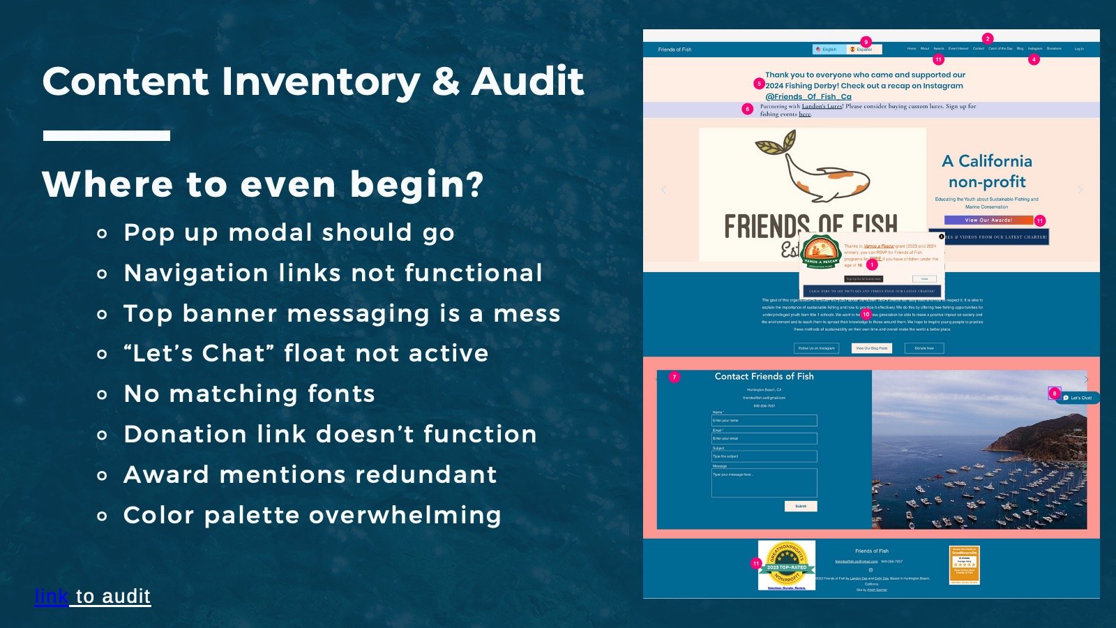
When determing when to begin, we had to look at the main issues on the home page. The popup was overwhealming, the navigation is messy, many of the links dont work, and the color palette was too much on the eyes
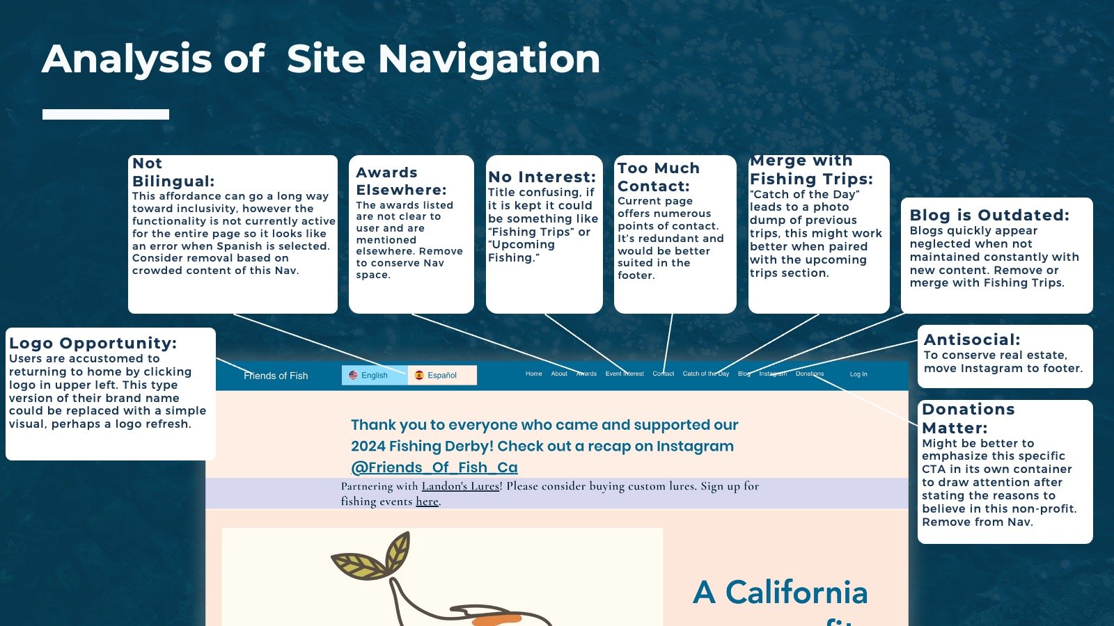
Here is a more in depth look at the existing architecture, which looks further into the issues with the original site. We looked into each section of the page and determined what needed to be fixed, mostly focusing on simplification and reducing noise.
We needed to focus on simplifying the navigation, streamlining the layout, and not overwhealming the user so they can easily move around the site. We also wanted to ensure the mission statement was clear and concise, so the user had a better understanding of the goals of the non profit
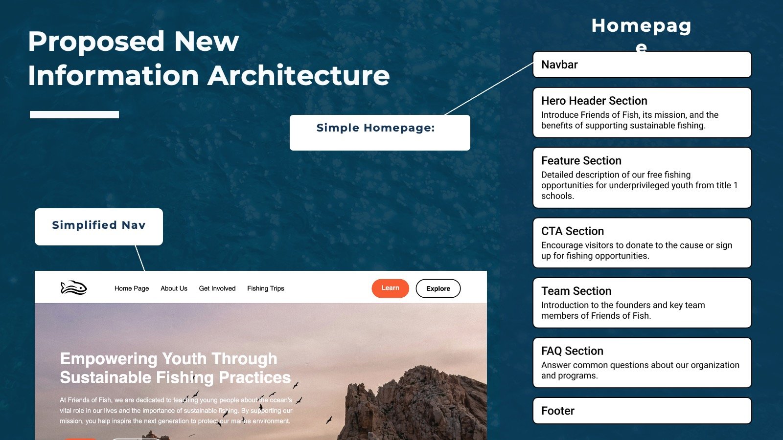
Our proposed new architecture highlights a simplified navigation and a simplified home page with clear sections.
Brand & Voice
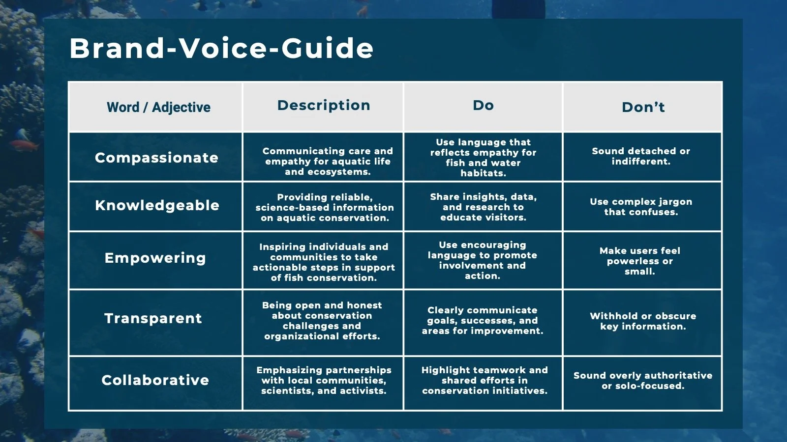
We felt that we wanted our new website to identify with the words compassionate, knowledgable, empowering, transparent, and collaborative.
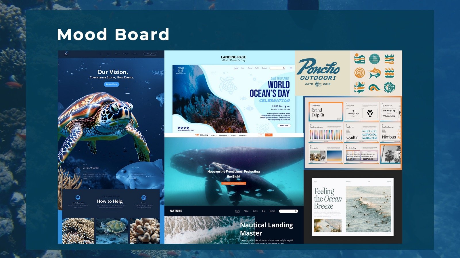
We created a mood board that we used for inspiration and ideas for our prototype, with an oceanic feel to it
Wireframe
In our initial sketch, we created this layout with goals to improve user experience through clear navigation, create a focused layout, and enhance mission communication. Our key principles are Hierarchy of information, Proximity to call to actions, and Color Theory.
We designed our pattern library with the intent to scale up, every component begins at the atomic level from our typography, buttons, icons ..etc.. it scales up to footer, nav bar and then hero sections.
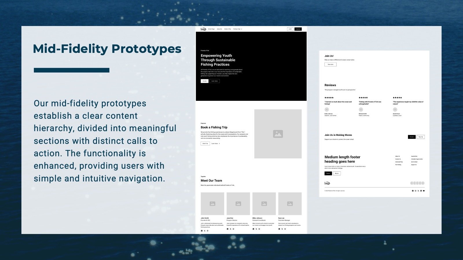
Our mid- fidelity prototypes establish a clear content hierarchy, divided into meaningful sections with distinct calls to action. The functionality is enhanced, providing users with simple and intuitive navigation.
Here is overview of our design annotations, we began to feel how the information was anchoring such as the headers and copy being left justified and respecting the space of a 12 column grid.
A/B Testing
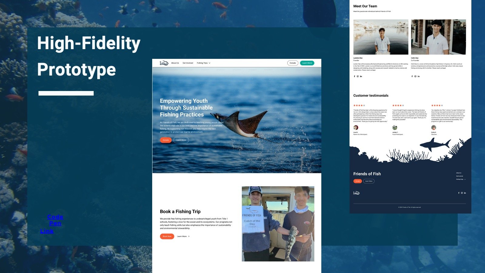
The control group/old website has a cluttered layout, unclear navigation and less engaging CTAs which make it difficult for users to interact or take meaningful actions. In contrast out new design features a clean, user-friendly layout with prominent CTAs, improved content hierarchy, and visually engaging sections that guide users toward donations and participation.
A/B Testing Plan
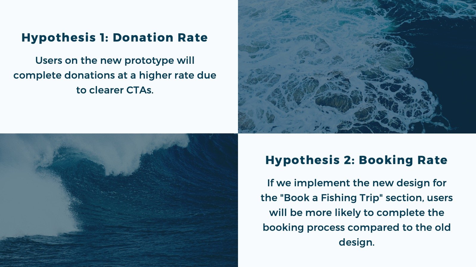
Donation Rate
•As a nonprofit, Friends of Fish relies on donations to fund its programs. A higher donation rate indicates that users are not only engaging with the site but also taking action that supports the organization’s mission.
•If the donation rate improves on the new prototype, it demonstrates that the design changes effectively guide users toward meaningful actions.
Booking Rate
•A low booking conversion rate on the old site may indicate issues like unclear CTAs, poorly structured content, or lack of visual emphasis on the "Book a Trip" section.
•A higher booking conversion rate on the new prototype would show that users find the content more engaging, can easily locate the booking functionality, and are motivated to complete the process.
A/B Test Findings
VERSION A
“It’s not clear.”
“They have a scrolling thing that keeps changing and I don't know what to look at.”
“Just really confusing all around because of the amount of content, the amount of words in different fonts on there, and then the main picture keeps changing.”
“Donation page isn’t working”VERSION B
VERSION B
•“Version B is clean and properly sectioned out so I can tell what sections go where.”
•“Very clean and easy to navigate”
•[CTA Buttons] “Their donation button, I see it in three places without even trying to find it. It's at a glance, it's right there, it's easy.”
•“It looks very easy to follow and without the original colors it’s easier to navigate”
Our findings showed that the original website was unclear and overwhelming to the eye. The new version was cleaner and properly sectioned, so the usability increased.
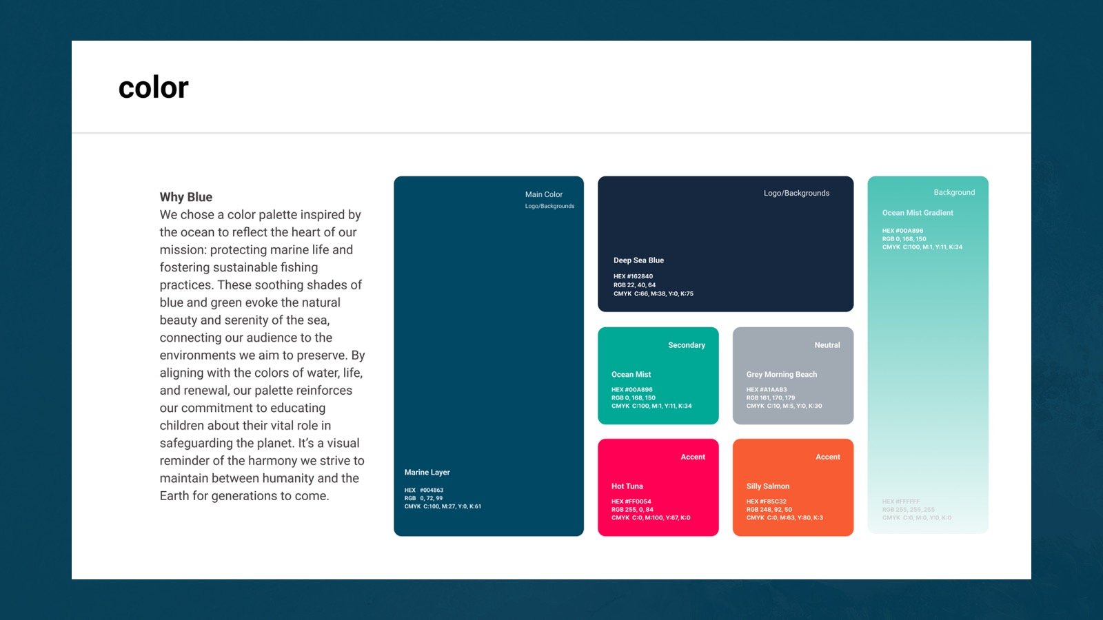
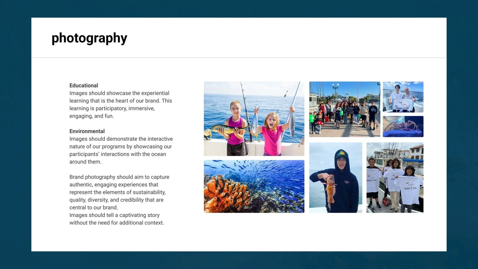
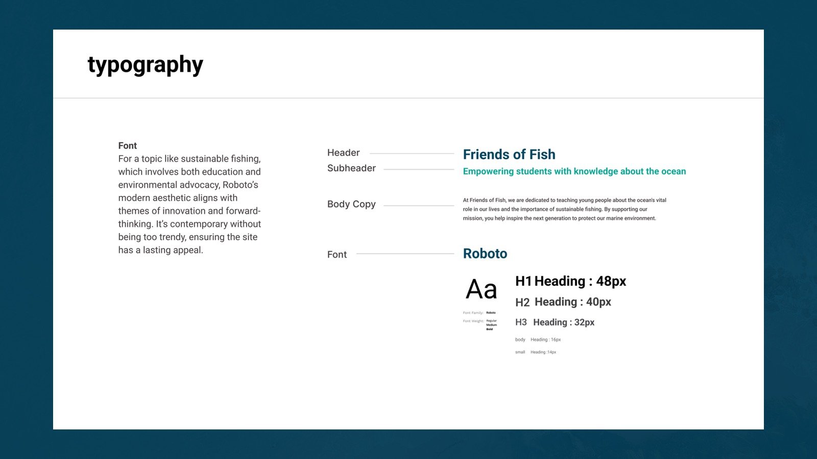
Style Guide
Final Thoughts...
What Went Well
Clearer Messaging: Streamlined content effectively communicates the mission and goals of Friends of Fish.
Improved Usability: Simplified navigation and intuitive layouts make it easy for users to find information and take action.
Engaging Visuals: Enhanced imagery and design elements highlight the beauty of marine life and the urgency of conservation efforts.
Stronger Call to Action: Strategically placed CTAs encourage donations, volunteer sign-ups, and community involvement.
Future Improvements
Interactive Features: Link to tools like an ocean health tracker or real-time project updates to engage visitors.
Volunteer Management: Consider a portal for recruitment, scheduling, and communication with volunteers.
E-Commerce Expansion: Add a shop for sustainable products to support fundraising efforts.
